Final Images

sally2 david 2 kev 2


These are the final photographs that I have chosen to hand in. I have decided to print the middle one A0.The one that I am printing up to A0 was taken on the phase one camera and the other two where shot on the D800. In all three of the images I used flash but the last image shown I had to use a zoom reflector and bounce the flash of the celling. This was only because I could not book one out the store for the day I wanted it.

I am pretty pleased with how the images have turned out. If I was going to do any of the images again I think I would reshoot the A0 one. This is because the model is not quite were I wanted him in the frame. Apart from this I think the images have come out really well.

Irving Penn

Irving Penn was born in 1917 New Jersey and died in 2009. Penn studied at the Philadelphia Museum School of Industrial Art, under the tutelage of Alexey Brodovitch who was a Russian graphic designer. In 1953 Penn established his own studio were he photographed a number things including still life and portraiture.

Penn has been one of photography’s conspicuous innovators in the two oldest and most successful genres; still life and portraiture. It is unusual for an artist to be so comfortable in both of these genres But that’s what was so special about Penn, he had the ability to photograph amazing still life and portraits.

One of my favorite and most inspiring still life’s that Penn did was the cigarette. Penn found his subject matter just outside on the street. He then took these cigarette ends into his studio to photograph.      Penn transformed one of the most consumed and discarded products from consumer society and turned it into something beautiful. Penn photographed the cigarettes using the platinum palladium process. By using this prose Penn has made something as insignificant as a cigarette butt, and made it into and object of desire.


photo 4-2 photo 3-2 photo 2-2

Annie leibovitz

Annie leibovitz is a world famous photographer most well known for her coloration with Disney. Leibovitz was born October 2, 1949, in Waterbury, Connecticut.

What Leibovitz has done hear is she has taken the old Disney cartoons that we all know and love and she has brought them to life. By using famous people for her models. Leibovitz gives the viewer a relationship with the image. She has managed to relate the well known films with well known people.

Leibovitz has taken everyone’s childhood memory’s and made brought them to life. Leibovitz composes her images in a similar way to Gregory crewdson in the sence that they both have big budgets. However Leibovitz has many tiffrent components to her image. She then computer edits them to give the images this magical feel to them.

Leibovitz creates these images in such a way that when you look at them it starts to bring your childhood back to life. I think that what Leibovitz has don here is amazing and the reaction to the images can be quite emotional for some viewers.

scarlet-johansson-as-e2809ccinderellae2809dscarlet-johansson-as-e2809ccinderellae2809d hook hhg Alice-in-Wonderland-Beyonce-Oliver-Platt-Lyle-Lovett-550x328

Laura Letinsky

Laura Letinsky is a cotempary artist /photographer who was born in Winnipeg, Canada. She is now currently a professor at the University of Chicago, Department of Visual Arts.

Letinsky has been developing her style since the late 90s. 17th Century Renaissance painting has influenced her throughout her work. Using a large format camera letinsky creates these stunning images of what looks like the after mouth of a meal. Letinsky creates her images in a controlled studio environment were she smashes fruit and spills wine.

This effect of the destroyed dinner table give the work a Memento mori feel to it. The big empty space in the images gives them a sense of emptiness. Memento mori means ‘remember that you must die’ so the empty whit in the images to me fells like that is the lose of someone and the leftover food is what has been left behind.

I really like the work of Letinsky I think that her images are simple but very effective. Also I think that her images are full of meaning and the sense that everything must come to an end.

3-15hmte-copy-copy 5-54hmte-copy-copy 6-92hmte-copy 7-60hmte-copy-copy

Still Life

In one of our practical lessons we learned some handy tricks on how to photograph glass. We started off by setting up a table with a soft box directly behind it. We then set the camera up on one of the studio tripods that was then pointing into the flash. After setting up the camera we then took our first meter reading. When we had the reading we had to close the aperture down by two more stops because we were shooting into the light.

This was the first shot that I took. It is correctly exposed and looks ok but you cant really see the glass very well.

20140306 Alphq Still life4979

To make the glass more visible there is a handy little trick. If you get two bits of black card and place them ether side of the glass object. The reflection on the glass will show the outline of the bottle or vase that you are photographing.

EmptyName 2

This is the setup that I had for my shoot. Also to get this affect i have placed the object on a sheet of glass this then gives it the mirrored effect hat is shown in the image above. To finish the image off you then take it into photoshop and crop the image so you can no longer see the black borders. You are then left with a long image like this.

EmptyName 2 1


Keith Arnett

Keith Arnett was a well-known conceptual artist before he seriously picked up a camera. Although he is not that well known for is photography there was one project that he did called ‘Pictures From A Rubbish Tip’ that interested me. Arnett has taken these abstract photos looking in rubbish bags on a tip. Discussing as it sounds the way that he has taken these photos is amazing. When you first look at his images the colors are stunning. It is only until you get up really close that you relies wheat the image are actually of.

I like the images that Arnett has taken here but they are quite repulsive when you take a closer look. It is quite interesting to think that all of the junk and rubbish that is in this place once use to be in our homes. What Arnett has made me relies is that everything comes to an end and things that we once used to hold deer eventually become obsolete.

Not all of the mages that he took were at the rubbish tip he sometimes photographed in the studio. By photographing some of the rubbish in his studio Arnett has taken something that s literally rubbish and made it beautiful again.

Pictures from a Rubbish Tip 1988-9 by Keith Arnatt 1930-2008 Pictures from a Rubbish Tip 1988 by Keith Arnatt 1930-2008 Pictures from a Rubbish Tip 1988-9 by Keith Arnatt 1930-2008

Interim Crit

Max tableux 2


This is my Tableaux piece that I did for my Interim Crit. The idea behind this photograph was I wanted to take inspiration from Edward Hopper. I wanted to experiment with the light in my image in the same way as Hopper would paint it.

To create this image I placed a pro photo D1 flash behind the door. This flash lit up the subject and flooded out into the room. I wanted to make it look like the woman in the image is curious to see what is behind the door.

When I showed this image to my peers it made them want to go in and open the door to see what was behind it. For some it was quite frustrating for them. Another comment was that the door looked like it was a gateway to another world. This was because they said that the image is quite dark. However the red fabric behind the door was like the woman in the image was walking into a better more colorful world.

Overall I am quite happy with the feedback that I got. Although I don’t think that I want to pursue this genre.

Edward Hopper

Edward Hopper was an American artist (1882-1967) who was most famous for his paintings of American cities and city life. More than ant other artist Hopper made the visual iconography of the American city his own.

Filling stations, motel rooms and office spaces created this atmosphere of abandonment. The paintings that Hopper made were almost like stage set or stills from a movie. Hopper then placed these characters into his scene that gave the painting a whole different story.

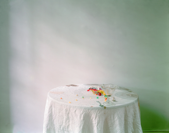
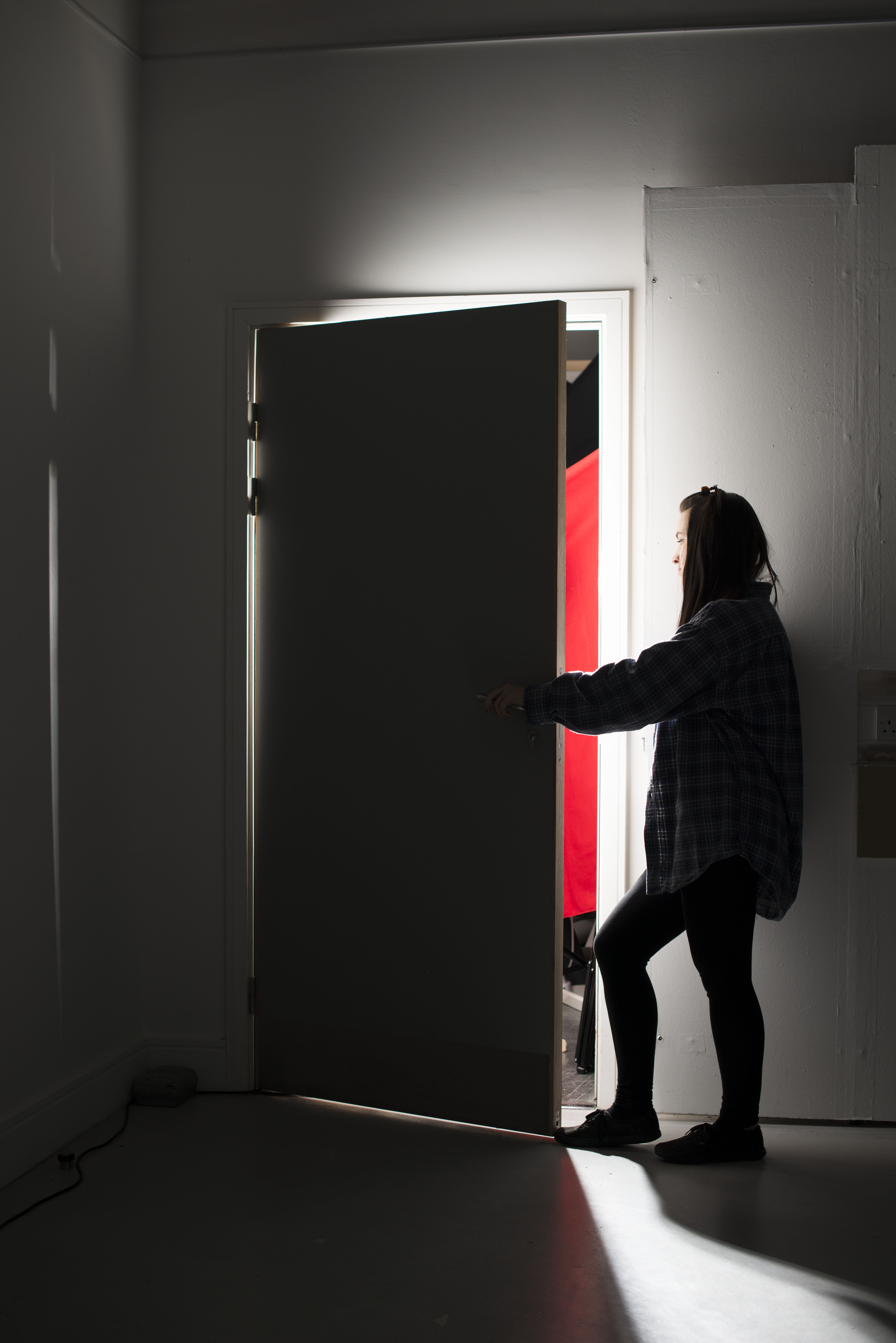
Hopper was above all painter of rooms and interior spaces. Not all of hoppers paintings had people in them for example ‘Rooms by the sea’. This is just a painting of a room that has the door open looking out to sea. Hopper paints this room with these beautiful shafts of light that cascade onto the walls and fills the room. The way that he painted the light was amazing. This actually inspired me to experiment with the light in my tableaux shoot.

The paintings that Hopper did with these beams of light offer a view to the outside world. It makes you want to go inside the painting and see the beautiful sun that is casting the shadow across the walls.

One of my favorite Hopper paintings is  ‘Nighthawks’. The way that Hopper has painted the light is this is amazing. Every time I look at this painting I think that it could almost be a photograph. The way that the light floods out the café and lights up the street is astonishing. The light in this image looks like it is coming from a flash with a zoom reflector that bounces of the celling. I think that his lighting techniques and the way he paints the light are stunning.

rooms-by-the-sea nighthawks


Final still life

still life max 1


I decided to change the bottle that i was using in the first shoot. This was because i really liked the cut of the glass in this bottle. When i was photographing it i really liked the refraction of light that came from the bottom.

This was also the image that I used in my Interim Crit. I had some good feedback and I think that everyone liked the image. My peers said that they liked the chamfered edges and they loved the bit of light diffraction from the bottom of the bottle. Another thing that was said was about the color of the image. My peers said that they loved the monochromatic feel that the image had to it. Overall I think I had very positive feed back on this image but I don’t think I an going to carry on with this genre.

Interm Crit


portrates 2 copy


This is the photograph that I used for my portraiture in my Interim Crit. Over all I think that my peers liked the image but there were a couple of adjustments that were mentioned. One person said that they would have liked to see the sofa in the middle of the frame because it was slightly off. I agreed with this point and agued that in this setting, because I was quite far back then it was hard to position the sofa in the center of the image. However I agree that it is something that I can work on.

Another reason that the sofa was not quit in the center of the image was I had the soft box in the corner of the shot. I had to keep moving my camera so the soft box wasn’t in shot. One of the solutions to this was suggested a peer. They said that is would be better to have the soft box behind the camera when taking the shot this way it wouldn’t be in shot.

I took everything on board that was said and I am going to work on these improvements. I think that I am going to stick with the genre of portraiture, as I don’t think I have explored it enough yet.